Portal Navigation Redesign
Discussions about adding the portal redesign to the company roadmap had been ongoing long before I joined the R&D department in 2019. During a slow period for the UX team, our lead asked me to start with a new portal navigation design.
Starting with Secondary Research
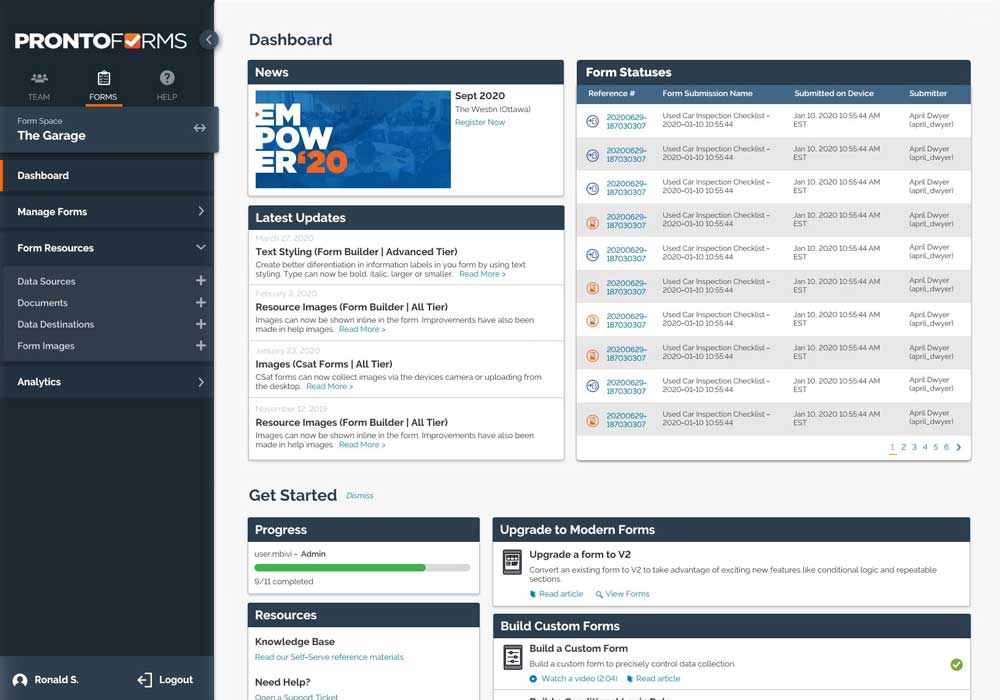
I decided to start with secondary research. First taking a look at competitors for trends and then best UX practices for building a navigation. Looking at competitors, I wanted to see if there was a standard location users might expect to find the navigation. I found a mix of top and side navigations meaning there was no clear path to execute based on Jakob’s Law - but it was even more clear just how out-of-date our navigation is. I took screen shots to compile in a presentation as I felt the team might’ve been slightly desensitized to the current look since they are likely not visiting competitor platforms frequently.
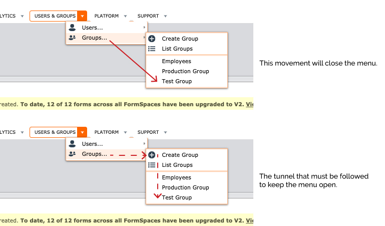
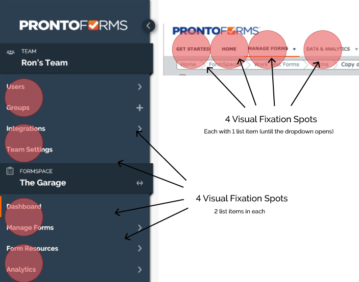
While researching best practices, I found 3 key insights that shaped the direction I would take the navigation redesign in. First, that top navigations work best for menus that have 3-5 options. Navigations that have more options than that do well as a side menu. The second insight was Visual Fixation. Based on Visual Fixation, users would be able to skim the side navigation menu items more quickly than in a top navigation. The final information piece was a poll that should roughly 67% of users disliking hover-drop-downs, which is what the current navigation uses.
Working in Sketch
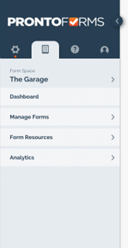
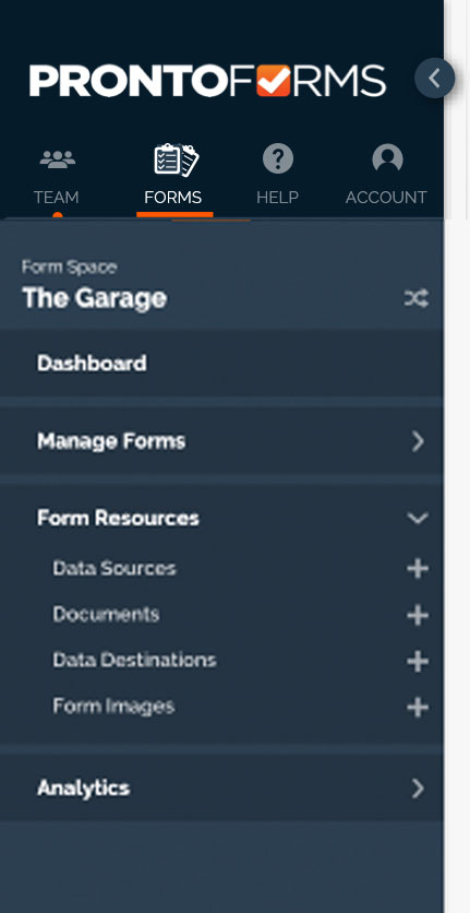
With this information in hand, I moved on to building designs for the new side navigation. Laying out all the menu links in a single view felt crowded and overwhelming. Based on some earlier interviews with users for research to a separate matter, I noticed a use pattern of the platform forming: Users would set up their account (users, production spaces etc.) but after that would be more focused on building and managing their forms. Only occasionally making changes to the setup areas or users. I wanted to design a menu that grouped these areas to allow users to better focus on the information relevant to their tasks.
I showed my samples of my navigation work to different team members to get input. The lead developer was particulalry excited to see the designs coming together. The most notible feedback in these early showings was that it was difficult to understand the icons so I included small text under each icon.

A/B Testing with Users
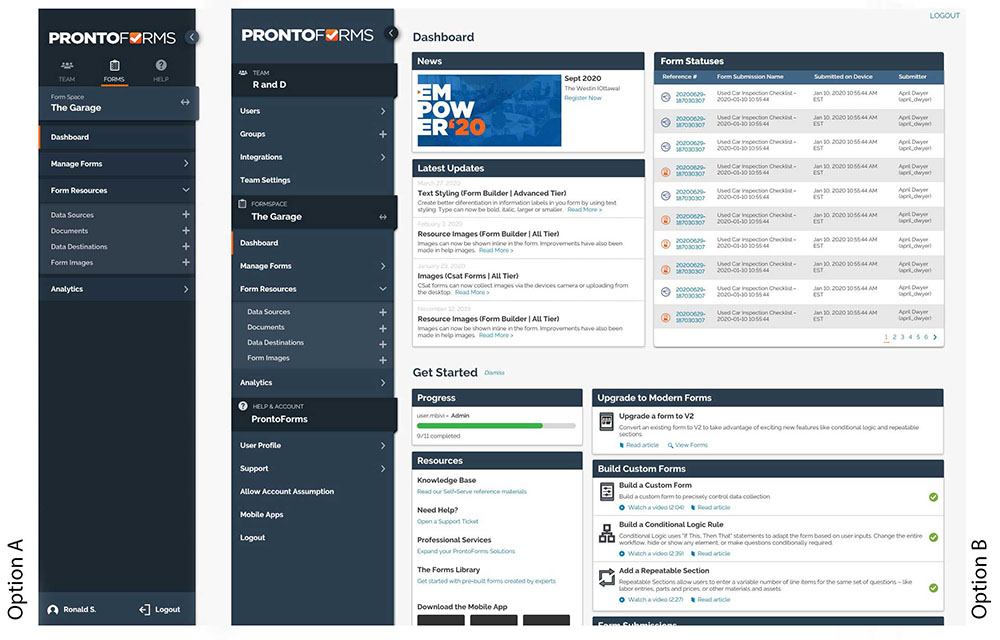
At the end, the team decided to conduct A/B testing with two menu types. One which was expanded and then the tab navigation which I built as prototypes using proto.io. We opted to test with 10 users because this would be a large change to the platform that would affect every user. Though this number became 13 – extra users sat in on some sessions and shared their opinions. In a notable session the user sounded initially displeased to hear about the redesign. However, at the end of the session when I asked if the users had any questions for us and they said, “when will I see this live in the platform?” After completing the test, the user seemed much more receptive to the upcoming changes.
Key Insights from Testing
Preference for option A started strong but, in the end, more users preferred option B.
One user brought their own drawings of the navigation. The drawing clearly dictated a side navigation and the user was really pleased to see our design.
Users struggled to identitfy that 'FormSpace' was a button. We hope the hover to indicate it is interactive will be more obvious with code and overtime.
Only one user mentioned having a preference for navigations with hover.
Wrapping it Up
I compiled my research, the users' feedback and some stats comparing the number of clicks and time to navigate the old navigation and the new design into a report that the UX lead presented to stakeholders. The result was that the navigation design (the start of the portal redesign) would be added to the product roadmap for the following year. I got to see development start before leaving ProntoForms and hope that upon launch at a larger scale, the design continued to recieve positive feedback.
Looking Back
These are a couple of things I would do differently with more time and different resources:
- If there was more time, I would have futher refined the final look for the full list navigation. While it is an improvement, I think it could be even better.
- With different tools and availbility from other team members, I would have liked for the users to choose one of the new designs and use it for a month (via actual code). Then review the information that would come back from such a test. Doing this would have tested the learnability of the new design. I'm also curious if a longer trial with more natural and daily use would have changed the users' preference? Perhaps, users would have noticed the tab navigation let them focus on their task as it matched their journey in the platform.