Platform Redesign
After a new logo and brand were revealed by Marketing in 2021, the next milestone for the company was a refreshed platform look to match.
In addition, as a number of users make calls to support and CX to accomplish their goals in the platform, the timing was perfect to revisit the UX. By simplifiying the platform's UX, we hope to see less calls to Support and CX.
Current Issues + Goals
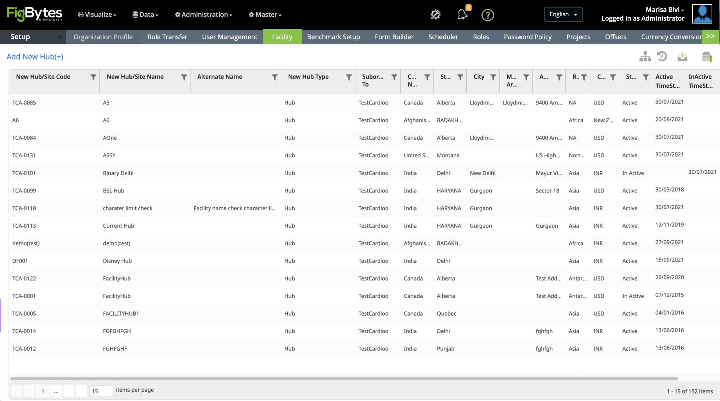
To showcase the changes, the stakeholders agreed on 6 pages as a starting point for a proof of concept. These pages are central to the flows for setting up a new account. I contributed to varying degrees on 5 flows to help the UX Lead with the massive project. Current problems in these pages (and the whole platform) are:
- • Many pages have multiple conflicting purposes and the connections are unclear
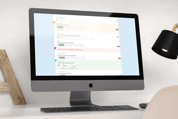
- • Vague labels on inputs and sections
- • Some inputs are redundant or have no impact
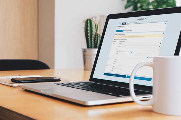
- • Some info needs to be completed in modals - which vary in complexity
The redesign needs to be WCAG AA compliant and responsive for tablets. As the platform is so information-dense, we didn’t feel a good mobile experience could be provided*. The Devs will complete the work of switching to a new code framework during the project.
* Perhaps we can build a lite version of the platform to meet any mobile demand later.
Style Guide
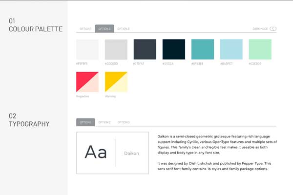
AAs a starting point, we needed to review the current brand guidelines and figure out how to use them within the platform – making any changes for the best UX/UI. The Senior Designer and I worked on style guide options as the starting point for the new product look. The UX and marketing teams reviewed the style guides to narrow the options. The next step was to mockup a sample dashboard using our top colour pallets, icons and fonts to make final choices. We agreed on solid icons, a card-style UI and a web font with broad language support before moving forward.
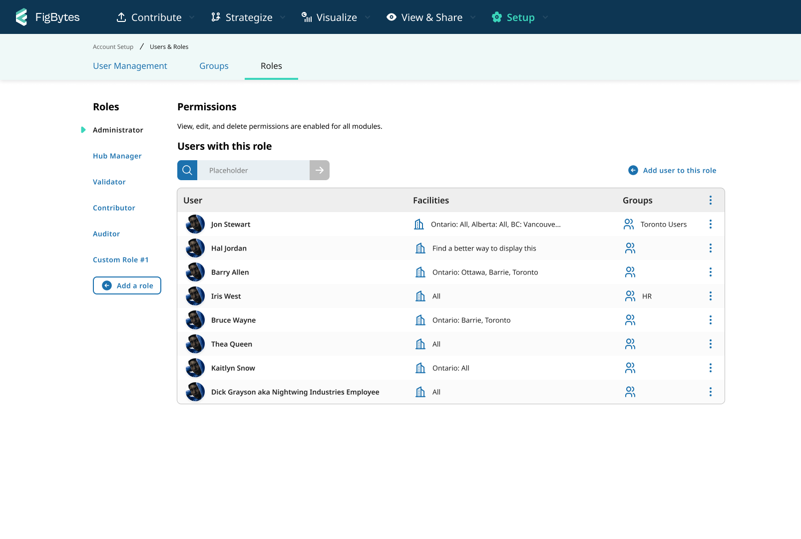
Navigation Design
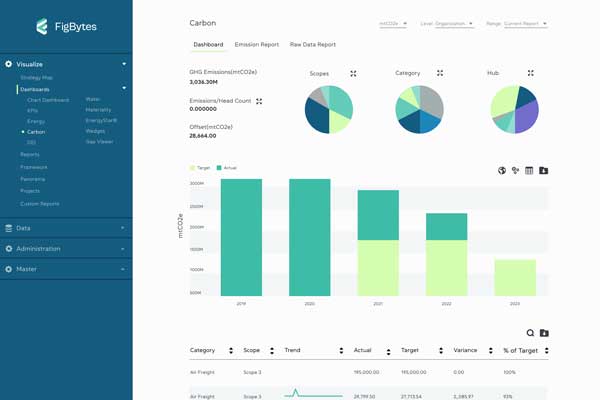
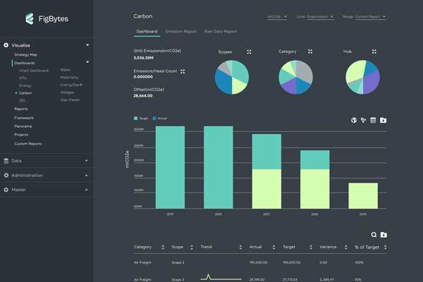
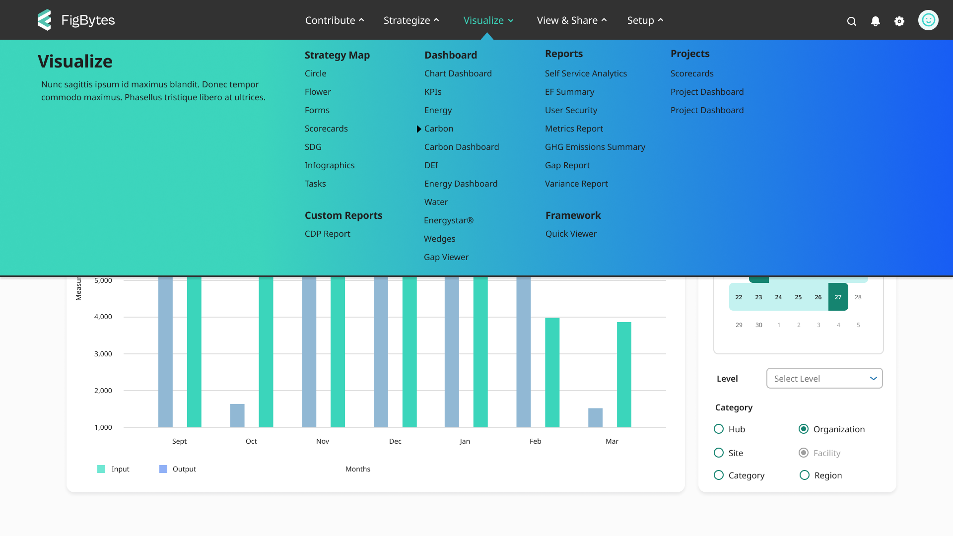
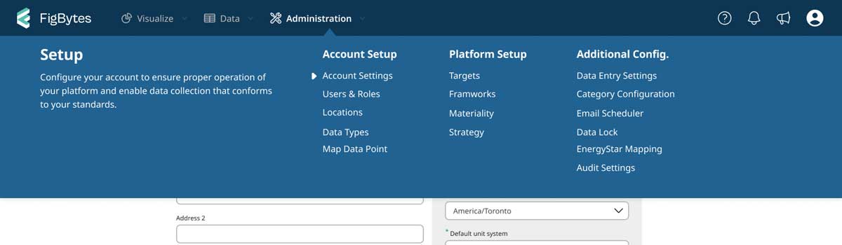
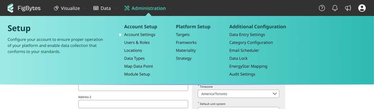
I was tasked with redesigning the massive navigation. I worked on both side menu and top menus until no more variations came to mind. From previous navigation design research I had done, I expected a side nav would be the best option. However, the number of links and levels in the navigation worked against this. After speaking with the UX Lead we picked one of the top-level options. I continued to polish the colours after the decision. The gradient look wasn't something I would typically try, but I liked it a lot. I was surprised many key stakeholders liked it as well, but as it reached the broader group there was a strong divide.
At a later date, the CEO requested we revisit the colours. The Lead and Senior designer each provided 2 additional colour variations, and I provided one more. These 6 versions got compiled into a survey that the UX Researcher ran internally (due to time constraints for a week). The researcher shared the in-depth results but in short: Blue (27%), Teal (25%) and Grey (23%). Based on the quantitative data and qualitative inputs, the CEO opted for the blue. I was happy both my colour options were in the top 3 and pleased to see that, as a collective, many felt the turquoise design best matched the brand feel – even if they didn't necessarily like it.
Building the Design System
Due to the tight time constraints for milestone one of the refresh, we opted to use a base library and build from there. We reviewed options as a team and picked one that used material design foundations. The UX Lead and I then completed minor changes to colours, spacing and typography. Then larger changes like filling in gaps, editing components we didn't like and swapping out icon sets. The devs used this library as a base to build the code counterparts.
This was my first library built in Figma. I found it was relatively trouble-free and far more flexible than the Sketch Library I worked on in the past! The whole design team enjoys the library, and their uptake has been pretty easy. In addition to this library, I hope to build additional guidelines and information to help the team use our library to its fullest.
Finalizing Page Design
Our initial direction for pages was card style, but we switched to a flat design not to shortly after. The UX Lead showed some of his preliminary work to the UX team, explaining how he felt something was off. I encouraged him to try a flat design instead. After making the change he was much more pleased with the design. I also provided him suggestions for the buttons and tie in elements better.
The UX Researcher met with users to show off samples of the new look. Some minor changes were needed to improve comprehension on a couple of pages, but all were really excited about the new look with the word 'clean' coming up 15 times in 4 sessions. One question I asked the Researcher to include was, "What other products does this new look feel like?" to which participants gave names like Google Chrome, Wealthsimple and MacOS. All these brands and products are viewed in high regard!
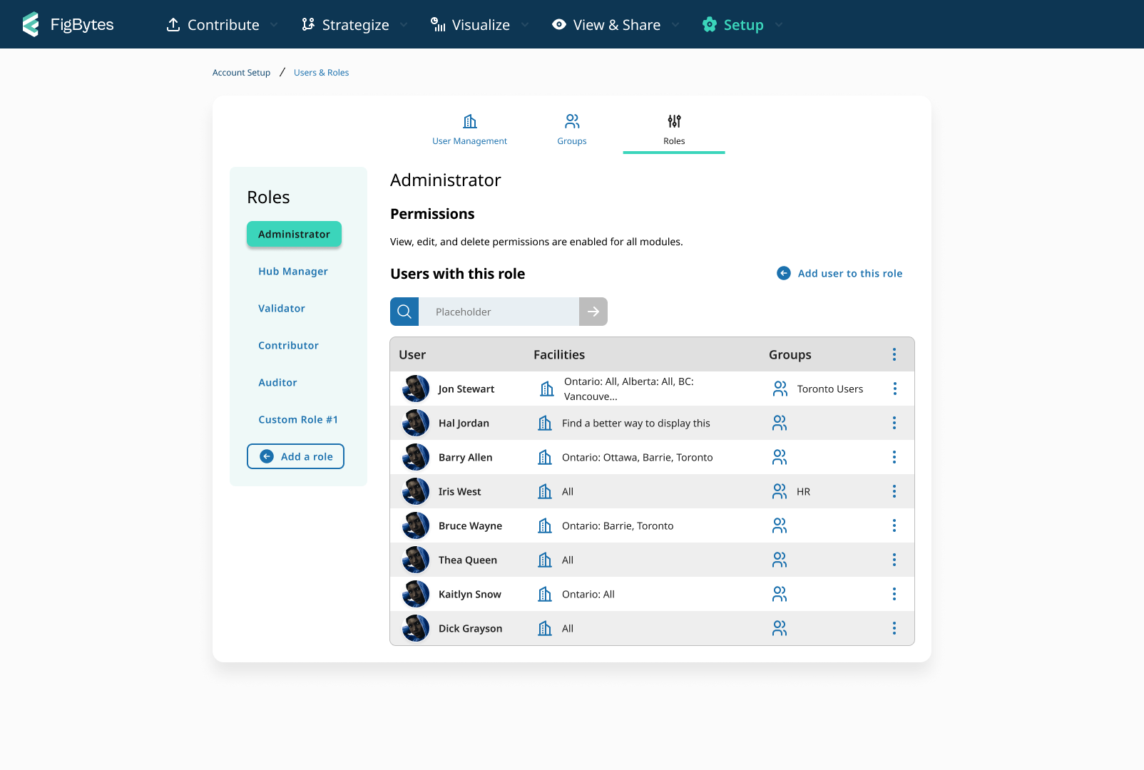
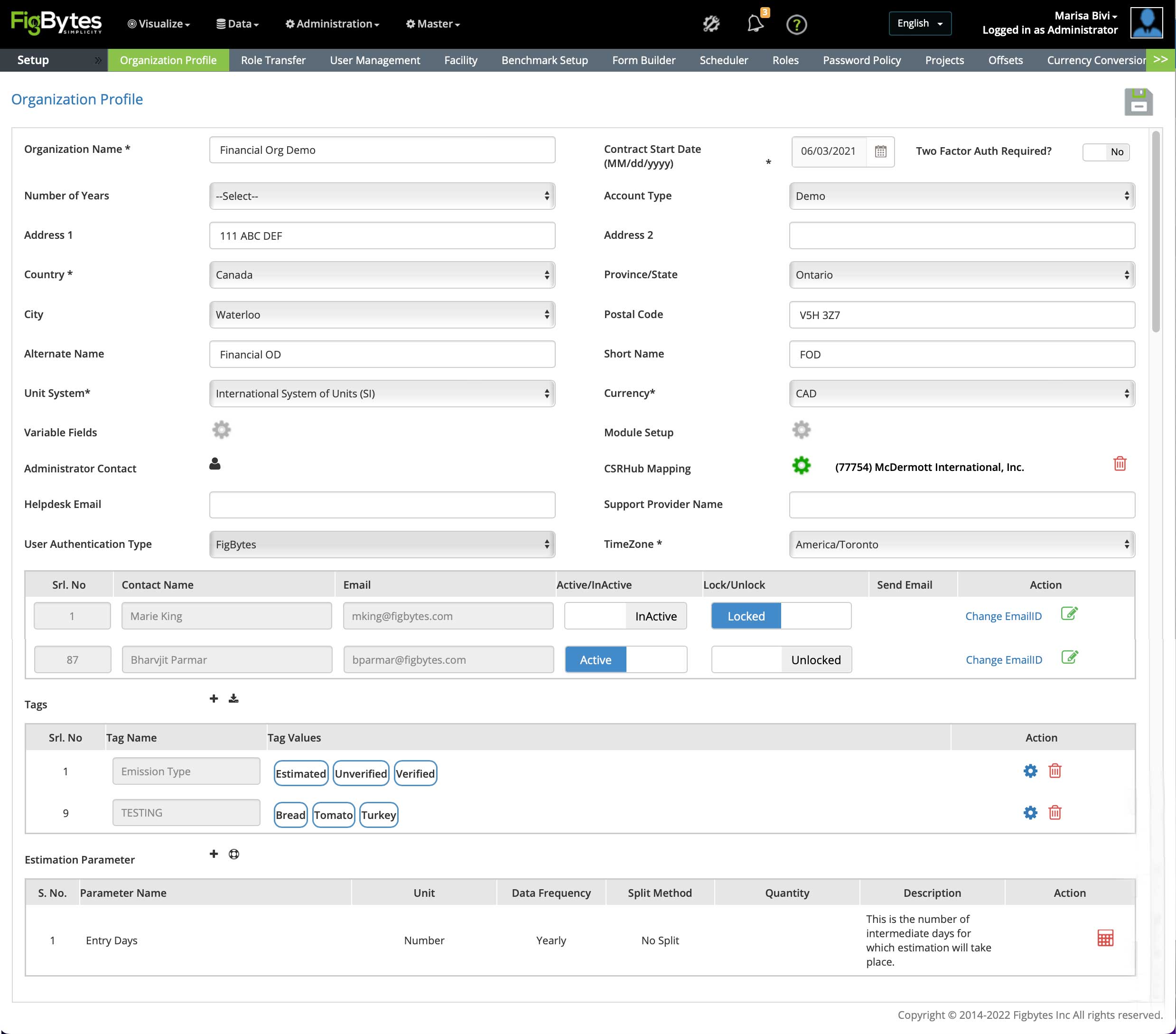
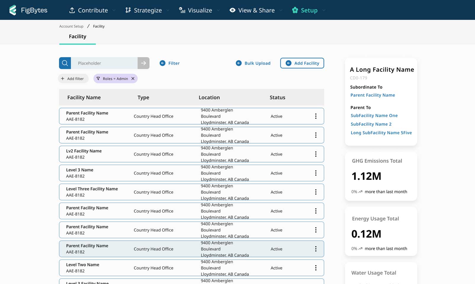
One key page I worked on was the Facility page. My designs were a huge change to the current table of information on the page. Given this and the short timeline, we put this new UI on the back burner for the time being. While I am confident in this design, I would like to speak with users about the current page first; what they like, dislike or any problems they have with it.
I hope it won't be too long before I get to continue making progress with this page. I think the new dashboard look will be much more helpful to users through the map and high-level stats to provide better insights about facilities. Also, this new look shows the add-on options in a meaningful way. Users being aware of the add-ons was a key concern for a few Project managers.
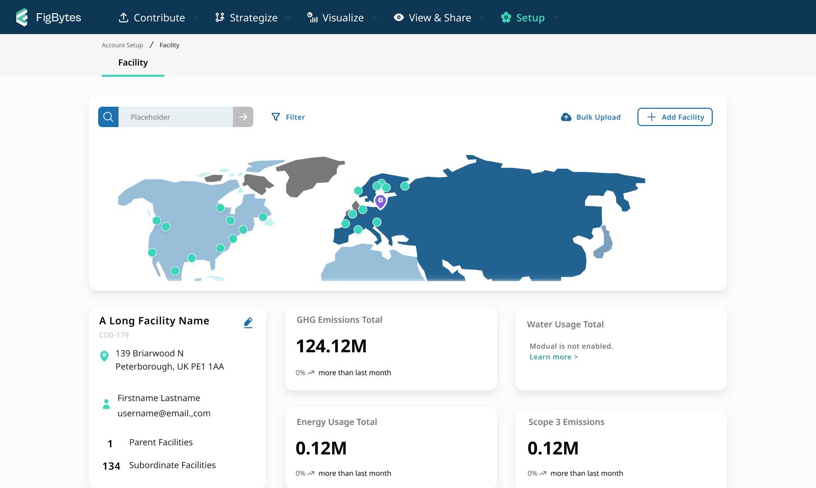
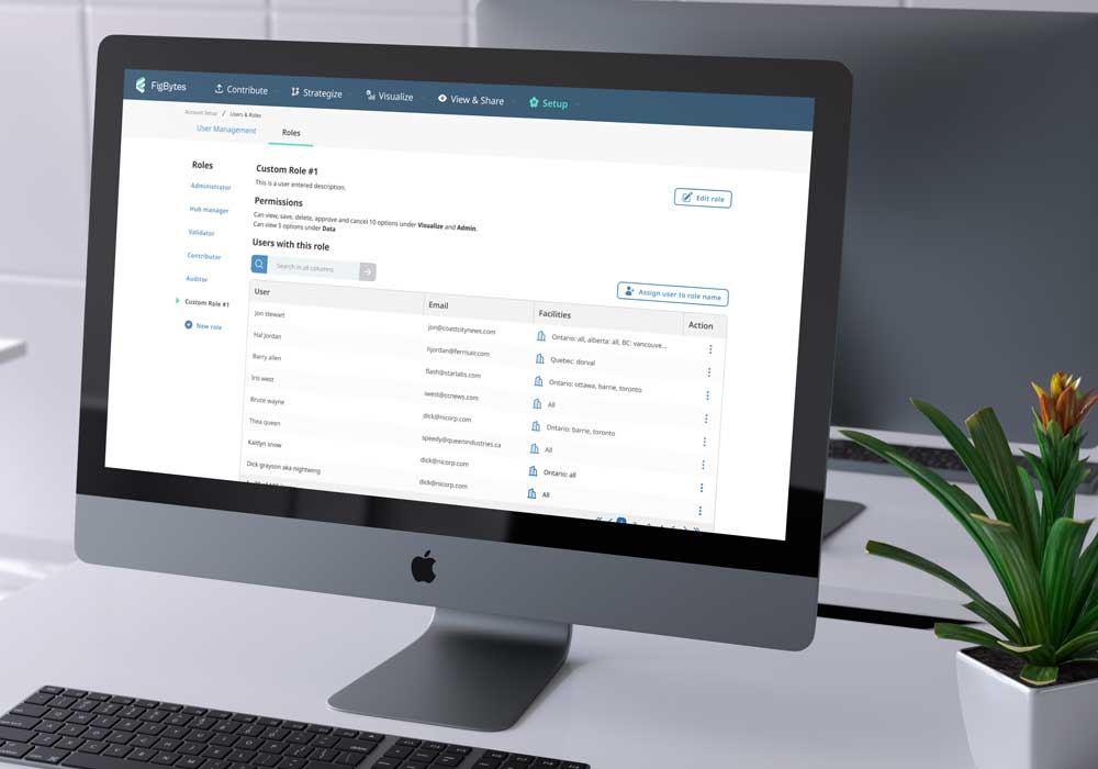
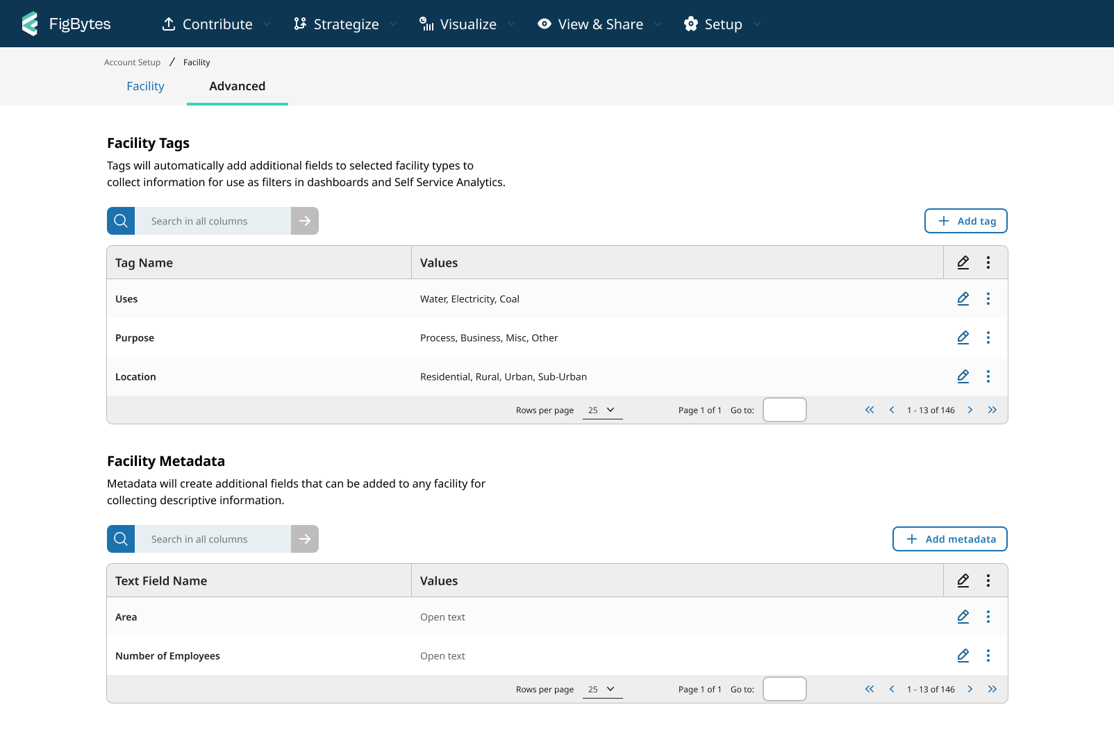
One change I am particularly proud of working on was the addition of the Advanced tab for facilities. This change came about after lengthy chats with different internal stakeholder to understand the actual use of a couple inputs on the Organzation profile. These names matched with other platform functions (but have different behaviours) and missed showcasing their connection or impact on facilities.
Moving them from the Organization page reduced inputs but, more importantly, improved understanding when tested with users due to the closer proximity: Especially with new names and descriptive text to explain their functions. The new UI now displays the lists of user contributions and the add button is visible – this makes the behviours consistent. Previously one of the lists was hidding in a model, and the add button wasn't clear for the other.
In addition, stakeholders happily welcomed the change! This was a relief as sometimes there could be strong attachments to previous functions that the UX team would have to navigate when suggesting new solutions.
Moving Forward
During the project, our UX Lead was laid off. Having spent the most time working alongside him on this redesign, I continue to work with the UX team to ensure we have a consistent look and functionality across our 4 current solution offerings. In addition, I manage the design library to continue to meet the teams' growing needs and update them on changes. As this covers milestone one (of three) for the platform refresh, I am excited to continue working on expanding this new look to more of the platform to help improve our users' experience.