Reusable Form Sections
I was tasked with creating a solution that had long been requested by users. Users sometimes need the same section across multiple forms for things like compliance requirements. To achieve this currently, users would need to rebuild the section in each form and make any changes in each form. Users have been requesting to share sections between forms which will help them save time and reduce errors.
Planning the Solution
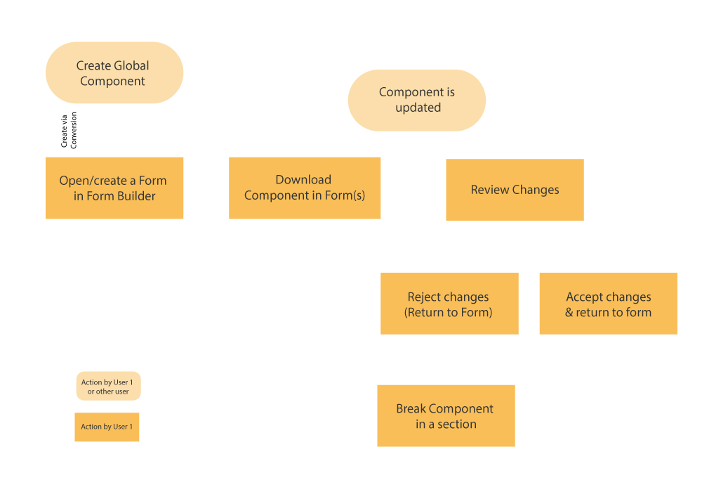
I mapped out the flow users would follow to use the new sections to help me plan what to build. Given the product there is a chance that this could all be done by one person or a multiple users in charge of different areas of their forms. If it's the latter, I knew users should be able to review changes made to the reusable section and, if needed, unlink the section. Though I expect, after the M1 launch, some companies will want to force updates to reusable section without needing User 1 to accept the changes.
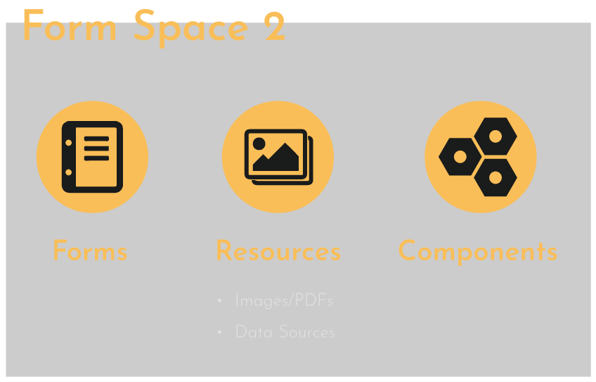
The new sections behave much like images and data sources in forms, so I felt they should live in a similar area of the platform for users’ comprehension. I anticipate users might request to limit access to the area and the separate location would make it easier to enforce. Overtime I see access permissions being a large piece in this solution but this isn't being tackled in M1. Nonetheless, I made notes of my views where these requests could come up for the team to keep in mind.
One thing I felt would increase the uptake of the feature when launched was to give users a way to convert an already existing section into a reusable one – rather than forcing the users to build the section yet again. It would be even better if we could then parse their forms to find and link any matching sections. However, this might be a security risk and it will likely depend on dev limits if this makes it into M1. I need to have further conversations with the team about the viability.
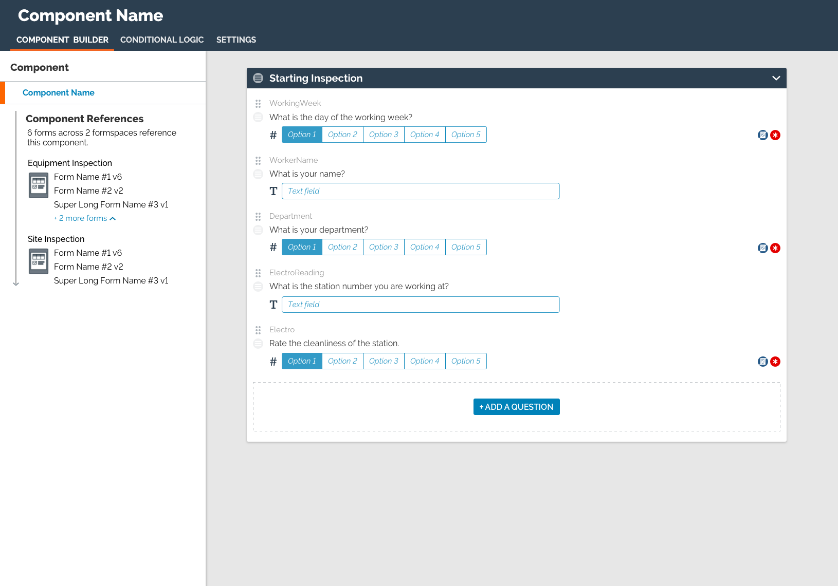
New Reusable Section Builder
This UI closely resembles our Form Builder product but with a darker colour header to indicate that this functions as a sublevel. Another larger change is that the left panel – which normally shows the pages in a form – now shows what forms use the section. Preparing for the possibility of future requests to use multiple sections and pages in a reusable section, I came up with other areas the form list could live. While reusable sections will be self-contained and won’t have downstream effects in forms, it still is important to have User 2 be aware of how many forms the change will roll out to.
When thinking about possibly needing to support multiple pages, I could see users wanting to dictate the placement of the reusable section in a form (start or end etc.). While not being supported for M1, I would envision this living under settings. There a user could also handle if the reusable section can be unlinked, force any changes into forms, or if a form can be deployed if the section is out of date.
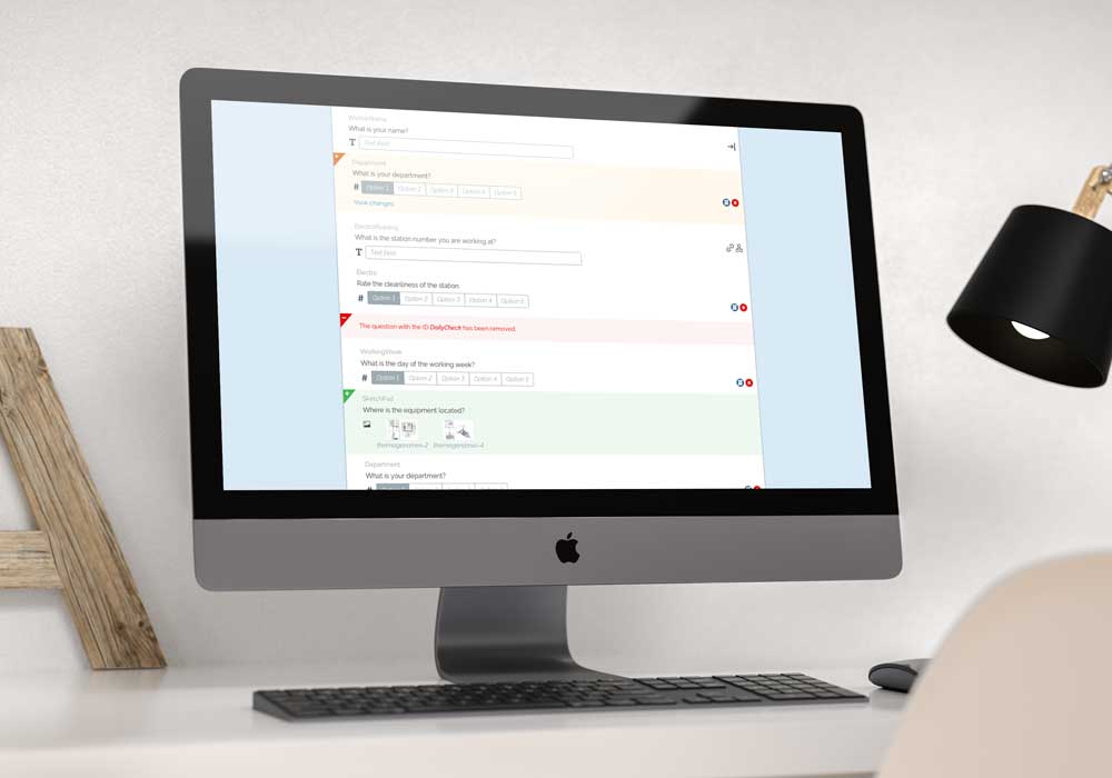
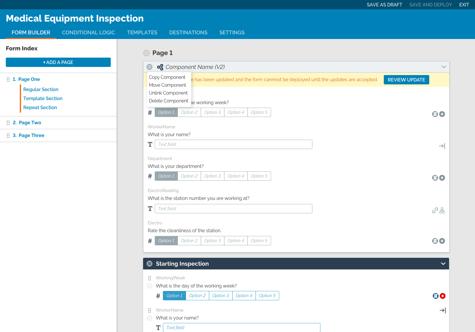
Changes in the Form Builder
In the Form Builder, you can see how a reusable section looks in a form and the way it is flagged to be reviewed. An indication that a form has an out-of-date component will be given externally in the portal as well. Initially, the button on this mockup said “update”, and the user would be taken to a screen where they would be shown the changes and accept. Coming back to it, I realized this wording was misleading and changed the text to “review updates”. I think the original text would’ve caused more stress and confusion to users and didn’t properly reflect the next step in the flow.
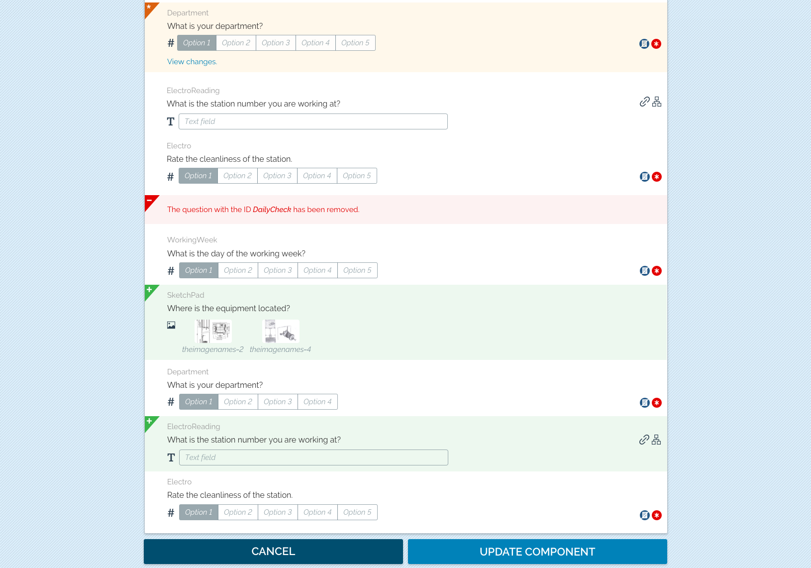
For the review screen, full section is displayed list for context. If multiple pages are introduced this would need some changes in the display to help users better understand the information. In the first round of feedback from Devs, they told me they didn’t want to build the review screen. I went back and came up with an alternate solution which used the “review” button as a toggle between versions inline which will require the user to pay more attention.
Changing Product Structure
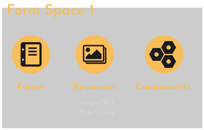
While for many it might be clear how the new feature fits in the product structure, I think we can provide a better experience revisiting the structure. The product is divided by Form Space which contains forms and assets the forms rely on. The reusable sections could also live with in a Form Space, but if needed by forms in different Form Space, we - to a degree - end up back at square one.
I think the reusable sections should live outside the Form Space and this would even work for other assets like images or PDFs. Then permissions would be given to the Form Spaces on which assets they can access. This would be something I would want to speak with users to validate that this isn’t an edge case. Though I suspect such a change would be too much from a development standpoint and instead the Reusable Sections will live in two spaces.
Wrapping it Up
There have actually been many new features I’ve worked on since that will affect this feature (one being Multi-Language Forms). If this feature came back to the table while I was still with the company, I would review to ensure proper support for those later features.
Before launch the name for this feature needs to be finalized. I worked on some options and felt one was a clear winner as the name was without ties to other features in the product that may confuse the user and give then different ideas of how the feature works. The name of the feature is removed from all the text.
After that, next steps would be user testing by turning these mockups into a prototype. From the insights about our users expectations of this feature I’d make necessary revisions to the designs. Then provide this information to the PO and Devs to finalize milestones. Once the feature is launched, we’d reach out to get feedback and then revisit milestones based on that feedback.